Task 1- Art of the game brief
Concepts
This concept was inspire by H.R Gieger and was supposed to be King Bomb holding back 2 chomps. I like my initial concept but did not choose this one to develop further as i didn't find it striking enough to be a main cover for the game.
This concept was inspired from the Cerberus character from Dante's inferno, designed by Wayne Barlowe. The character in my concept is Bowser.
I took inspiration for my flower concept from the the movie poster for "The Possession" i feel this was one of my weaker concepts but still had a certain potential.
Final outcome
This is the unaltered concept for the finalized game cover. I chose this one as it felt the most horrifying with the floating minions closing in and Mario/ the player being caught.
This is the finalised outcome for my horror poster of a famous video game. I feel though the swarm idea and the lashing onto mario restraining him and the fear portrayed on Marios face is really effective and in my opinion striking and in some ways disturbing which is exactly what a horror based poster should do
Task 2- Redesigning a character in a popular art form
This was the initial image i started with before added my artistic flare and re-design with fauvism. The character is Jennifer Tate from the game Primal.
this is the image after I re-designed it with fauvism as my chosen art form. I feel as it worked really well and i am pleased with the out come. there are a few rough edges with the hair i can address but nothing i feel that ruins the image. The colour and artistic style i feel really portrays the multiple personalities as seen in the game.
Character design concept
Theses are my initial concepts for game characters. I had a surreal art working style in mind and took inspirations from a variety of areas including the game Fallout 3


I really dove into the surreal aspect for my character design and tried to make him as scary/gruesome as possible i have inspirations form that of "Halloween before Christmas" and "slender"
Map design concepts


Finalized character
this is my finalized game character for my video game. i feel the surreal approach worked really well and i am pleased with my outcome of my character.
Finalized map
Units 1-3 Inspirations and Research
Ken Adams
Ken Adams
Ken Adams beautifully detailed sketches are incredible and the depth of feel you get and the sheer amount of detail and imagination gone into each of his base designs is really quite incredible and is something i wish to share in as i hope there to be and feel there maybe similarities in our work

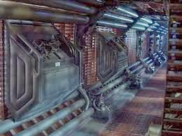
Chris Foss
HR Giger
HR Giger's alien base design and lien design is beautiful and something i really took inspiration from even though our works seem to be minimal in similarities, his work was always something i looked back to for a fresh idea.
Jack Kirby
Jack kirbys comic design are incredible and beautiful in the self shaded detailed feel although he wasn't as big an inspiration as the other artists his work was always something I could compare to and see how my work stood and looked.
Wayne Barlowe
Wayne Barlowe was my biggest inspiration for my character design. His surreal/Horror style really appealed to me and I wanted to use the style in my work. He has worked strongly in this style and from the beginning he was one of my largest inspirations. I made a few concepts involving some of his creatures and his work really helped me create my final design.


Aerial perspective
using aerial perspective in my work really aloud me to try and access a depth of feel and an actual scale on how large my island research center was, I know i have a lot of work still to do to make my aerial perspectives better but feel I've made a good start
Arnold Bocklin
Franz Marc
Franz Marc was a fauvist based artist who painted a range of scenery and animal pictures. His vibrant use of expressive colors and shading gives his pictures depth of feel which really makes his pictures feel more warm and welcoming vision to them.


