initial
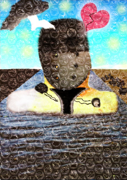
Re-design
mood board/ inspiration and ideas
flood
similar posters/ collages
Catherine McIntyre
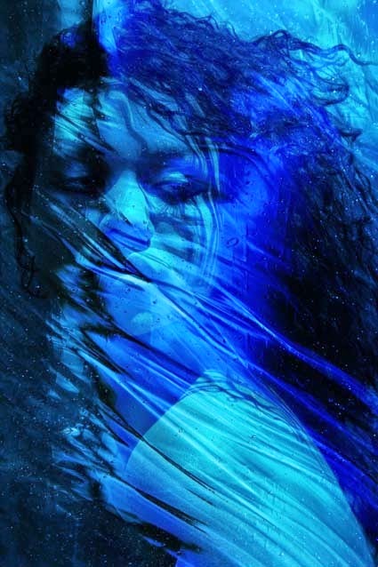
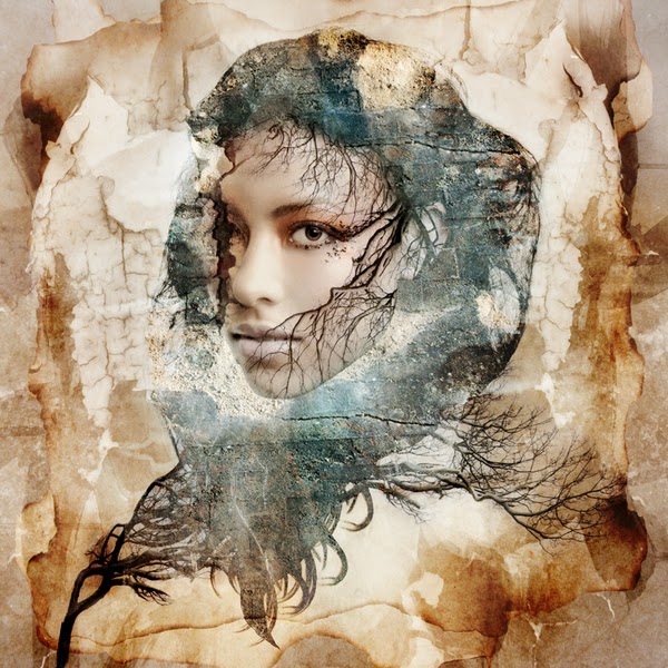
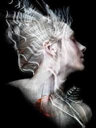
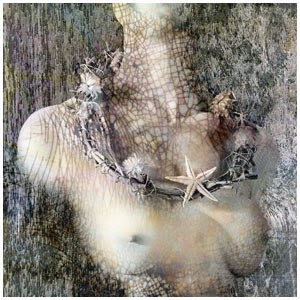
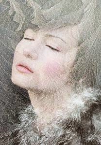
Catherine McIntyre is a talented collage artist who works commonly with faces and unique colouring and design. Her work can seem minimal but also has a very attractive and eye catching style as there is so detail within her works.
Why is her work topical?
What ideas,
both through form and content, are they
exploring?
Catherine McIntyre's form of work consists of photo media and texture blurring, manipulation and overlays and merging them to form and create the the art collage. Through this she shows a minimalistic sense of work that is very well executed and is enjoyable for the audience to view. Using minimalism also gives the impression that the content/ subject need little explanation or can also give the idea the the content/ subjects involved in the collage images are they themselves basic and minimal this can be shown with the subjects showing little emotion or basic/specific emotion e.g. sadness or fear or by using very few colours. As well as this however, many of her images can lead to many questions and confusion in what the message is which is another idea Catherine McIntyre is portraying that simplicity can be the most difficult to understand.
What techniques were employed
to produce the selected work?
Catherine McIntyre uses photoshop alongside collage and montage techniques a large array blurring and texture manipulation, such as overlaying multiple backgrounds, were used to construct the collages with faces commonly being the main and sometimes only focal point for the viewer. She also uses 'paste into special By keeping and sticking with only one focal point it dosent overwhelm the viewer and allows the viewers eyes to glide and enjoy the visuals of the collages.
How does
their work relate to traditional art forms
or the works of earlier artists?
Catherine McIntyre's work can be considered to resemble that of work by other artists such as van Gough, Andy Warhol and Pablo Picasso. This is due to each of them having a unique approach to portraits which highlighted some of their greater art works and that particular art movement. Catherines work is simular in the sense that its the next step forward in art being 'Digital' art and allows art to evolve to the next step. Where as Van Gough was post-impressionist, Picasso was cubism, andy warhol was comic/pop art Catherine provides the next step to evolve with 'digital' art while not sacrificing its heritage or real talent, skill and impressiveness of the artist.
How does
it define, critique, or embrace the future?
Catherines work embraces the future as we are now in a digital and with an ever growing number of photo manipulation software more and more people are turing to digital media to create their artworks as well other profesional digital artists who already use these programs showing an increased amount of compation
Do you respond (or NOT respond) to its
content, its construction, its aesthetics, or its
storyline?
I feel as though I do respond to the content as it shows a large expansion of various types of media from photos to textures and other visuals that have been manipulated and blended to form the collage and while each of her works are different they all follow a consistant style which makes the work even more appealing as her work becomes comfortable and even though in some ways predictable each collage is unique enough in its own way that I, the viewer never get bored from looking for new works. The construction of her work looks professional yet modest with an obvious build up of multiple lairs and many hours have been poured into development for each one. Some of the textures themselves show to have lots of time worked into and perfected to match and fit the rest of the collage from ones that look to be a build up of tea stained paper and branches to sheets of fabric warped and modified to match its underwater theme these fine details really build the collage around its focal point and shows of the artist talent and skill. It is extremely enjoyable to view.
Collage test
Initial sketches
Initial collages
updated collages
Collage 1
Collage 2
Development
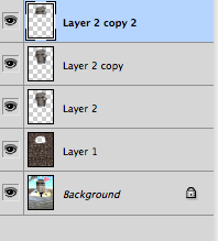
Layers iv'e used
Layers iv'e used
Inspiration
Collage 1
I started by inputting my picture I took of some water and adding a poster edge filter to it
Next i added a dark grey sky by cutting it out from the pictures I have taken and adding it to the collage
I then added the church and did some editing to submerge it into the water at the right height
I then cut out and added both a boat and a standing picture of me into the collage a and merged them together (had to be careful with the scale of the objects)
Finally I cut out and added clouds from other pictures I had collected in the picture to try and give it a more 3D feel
Collage 2
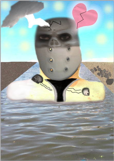
This is how My collage originally started off with a picture of myself only missing my face

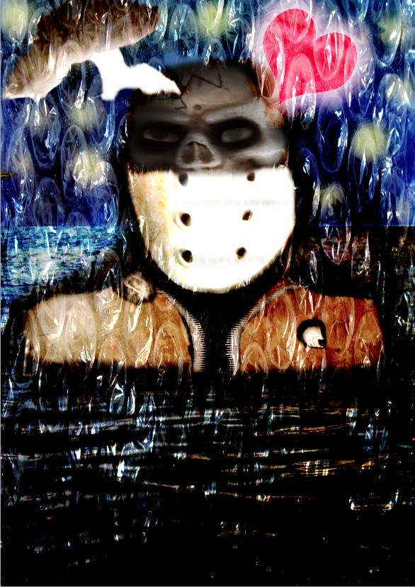
I then proceeded to put in my mask and overlaid in with a duplicate of itself to make it brighter and more vibrant.

I then added a lightly coloured yellow paint over my skin then overlaid and duplicated it to act as a texture to further lighten my skin and then added a drop shadow to give the body depth.

I then added the water beneath the body and edited it around to give the perspective that i was being submerged. I then added another layer of the water and used linear burn to darken the water around the body to draw attention to the lighter points.
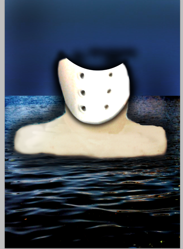

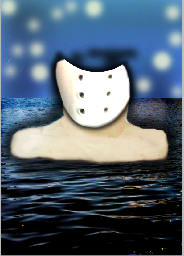
I then put in a picture of the sky for background and the same colour yellow used on my body to the background and used colour dodge to lighten it. I then took a fading brush and at various sizes and added light yellow spots that somewhat resembles Van Goghs starry night. The real mening of the represent specs of hope during bad times of someones life
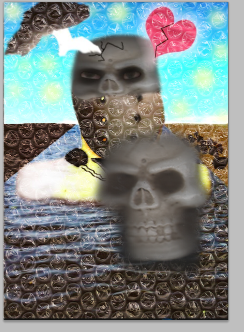
Next I cut out and merged in the skull and my jacket zip on my chest and coloured in the necessary area black. With the skull I again duplicated it and overlaid it to darken the skull and to give the skull more depth. The reason I used a skulls head is because it represents how someone can feel dead inside and their view on the world is darkened.
I then added The Cloud by cutting it out from a morning sky picture i took and the heart from a sheet of A4 papper I scanned in. I duplicated the heart and used Hard light to brighten it and added an outer glow to give it a shine. The lightning bolt is actually the sun from the same picture as the cloud cut out and re-shaped to form the bolt, the cloud has also been duplicated and overlaid to brighten it as well. The cracks on the skull were done using a separate layer and by simply painting them on.
I then added the skulls on the chest escaping from the gaping whole, theses are supposed to represent fear
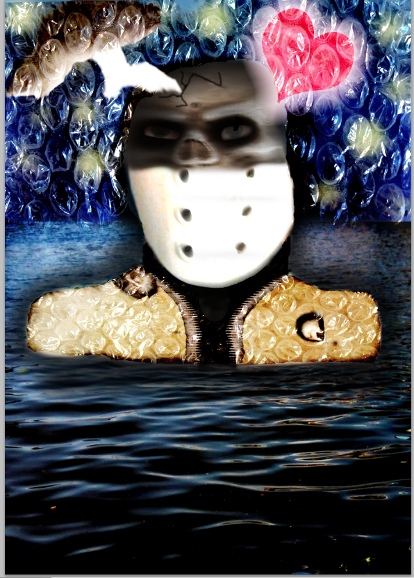
I then added a bubble wrap texture and this really made the colours more vibrant and defined especially on the background and the heart.
I then cut out and around the main body as the entire texture was too overwhelming but still left it eher it was effective
Finally i added a fire texture inside my unzipped chest to represent the anger and raged trapped within
Attempted designs
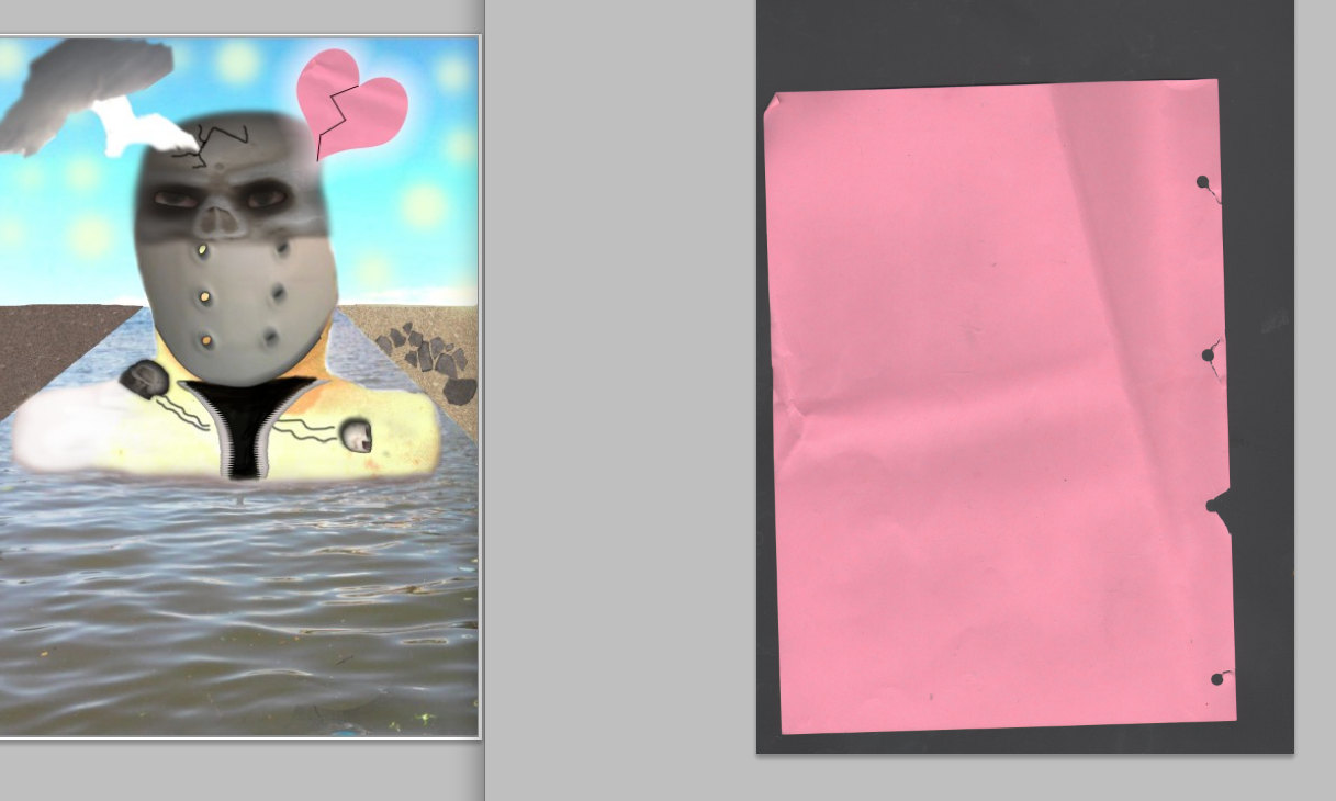
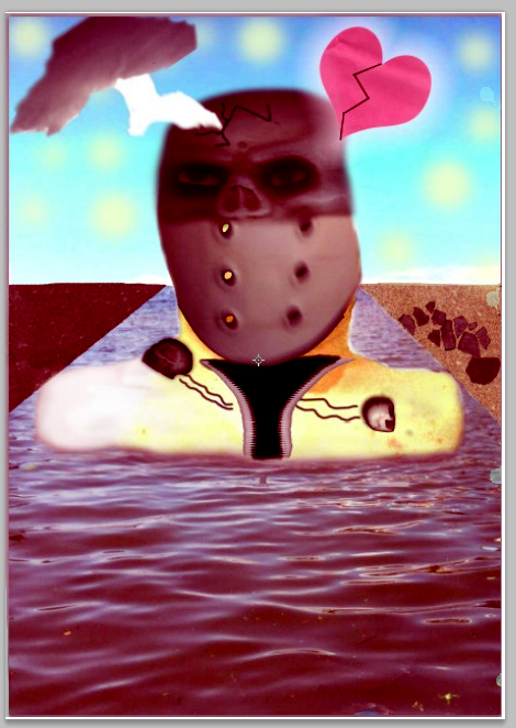


Bellow is a collection of all the images i used or could of used when building my collage






.jpg)
.jpg)
.jpg)
.jpg)
.jpg)
.jpg)

.jpg)


No comments:
Post a Comment